A.
[ Overview ]
A Brand and Design Studio
Working Across Lifestyle,
Hospitality, and The Arts
C.
[ Past Projects ]
About
Escent is a multidisciplinary brand and design studio rooted in London, creating narratives across identity, print, and digital.
We value creative expression and the forms it can take, drawn to details and nuances beyond the expected.
Approach
Our approach is intentional. At the centre of each project is a process we call f.r.a.m.e
Foundation:
We understand the core of your brand through a collaborative strategy session: who you are, what you stand for, and how you want to be perceived.
Refine:
We explore creative directions that embody those values and feel true to you.
Apply:
We translate strategy and research into a visual identity: type, colour, imagery, and the details that carry your story.
Model:
With the identity finalised, a clear set of brand guidelines ensures it's applied consistently across every platform.
Express:
You leave with everything you need to launch: final files, assets, and a confident handoff.
Services
Creative Direction
Brand Strategy
Visual Identity
Website Design & Development
Print & Packaging
Escent is a multidisciplinary brand and design studio rooted in London, creating narratives across identity, print, and digital.
We value creative expression and the forms it can take, drawn to details and nuances beyond the expected.
Services
Creative Direction
Brand Strategy
Visual Identity
Website Design & Development
Print & Packaging
Approach
Our approach is intentional. At the centre of each project is a process we call f.r.a.m.e
Foundation:
We understand the core of your brand through a collaborative strategy session: who you are, what you stand for, and how you want to be perceived.
Refine:
We explore creative directions that embody those values and feel true to you.
Apply:
We translate strategy and research into a visual identity: type, colour, imagery, and the details that carry your story.
Model:
With the identity finalised, a clear set of brand guidelines ensures it's applied consistently across every platform.
Express:
You leave with everything you need to launch: final files, assets, and a confident handoff.
D.
[ Past Projects ]
Recent Work
01.
[ Archive ]
Studio Nicholson
Creative Direction
New York, NY
10/2022
Overview
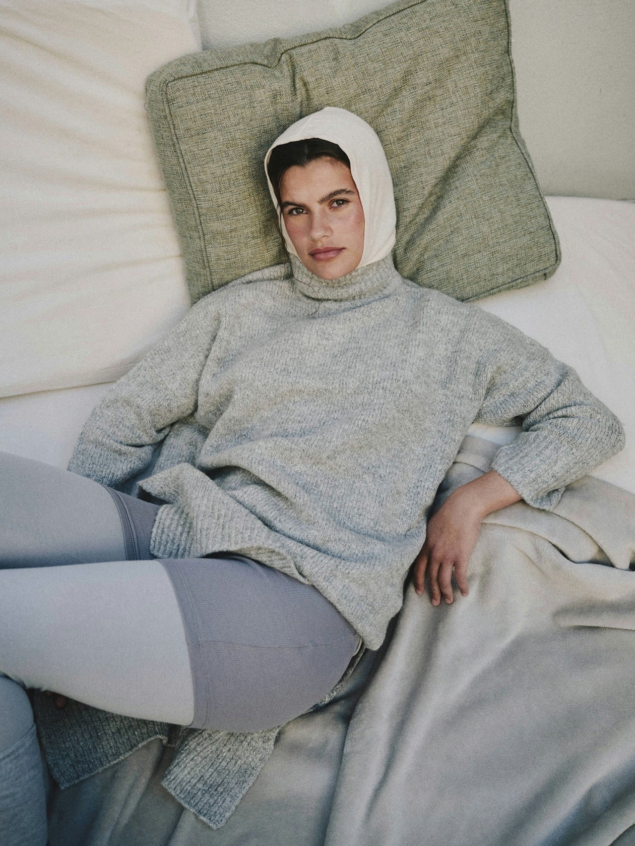
Creative direction for a campaign exploring the studio's relationship to work, durability, and everyday utility. The project focused on developing a clear visual framework across photography and set design, balancing the brand’s industrial heritage with a contemporary, editorial sensibility. Attention was given to location, casting, and material detail, ensuring the imagery felt grounded and functional rather than styled. The result was a cohesive body of work that reinforced the studio's identity while allowing space for nuance and modern interpretation. Visual decisions were guided by longevity rather than trend. Shot in New York over 3 days with a crew of brilliantly talented friends.
Collaborators
Set Design — Susan Friar Photographer — Randy Lawrence Art Direction — Alexander Smith First AD — Rose Whitman Make-Up — Flo Ware
[ Prev
1/5
2/5
3/5
4/5
5/5
|
Next ]
01.
[ Archive ]
Studio Nicholson
Creative Direction
New York, NY
10/2022
Overview
Creative direction for a campaign exploring the studio's relationship to work, durability, and everyday utility. The project focused on developing a clear visual framework across photography and set design, balancing the brand’s industrial heritage with a contemporary, editorial sensibility. Attention was given to location, casting, and material detail, ensuring the imagery felt grounded and functional rather than styled. The result was a cohesive body of work that reinforced the studio's identity while allowing space for nuance and modern interpretation. Visual decisions were guided by longevity rather than trend. Shot in New York over 3 days with a crew of brilliantly talented friends.
Collaborators
Set Design — Susan Friar Photographer — Randy Lawrence Art Direction — Alexander Smith First AD — Rose Whitman Make-Up — Flo Ware
[ Prev
1/5
2/5
3/5
4/5
5/5
|
Next ]
01.
[ Archive ]
Studio Nicholson
Creative Direction
New York, NY
10/2022
Overview
Creative direction for a campaign exploring the studio's relationship to work, durability, and everyday utility. The project focused on developing a clear visual framework across photography and set design, balancing the brand’s industrial heritage with a contemporary, editorial sensibility. Attention was given to location, casting, and material detail, ensuring the imagery felt grounded and functional rather than styled. The result was a cohesive body of work that reinforced the studio's identity while allowing space for nuance and modern interpretation. Visual decisions were guided by longevity rather than trend. Shot in New York over 3 days with a crew of brilliantly talented friends.
Collaborators
Set Design — Susan Friar Photographer — Randy Lawrence Art Direction — Alexander Smith First AD — Rose Whitman Make-Up — Flo Ware
[ Prev
1/5
2/5
3/5
4/5
5/5
|
Next ]
02.
[ Archive ]
& Other Stories
Art Direction & Photography
Stockholm, SW
02/2022
Overview
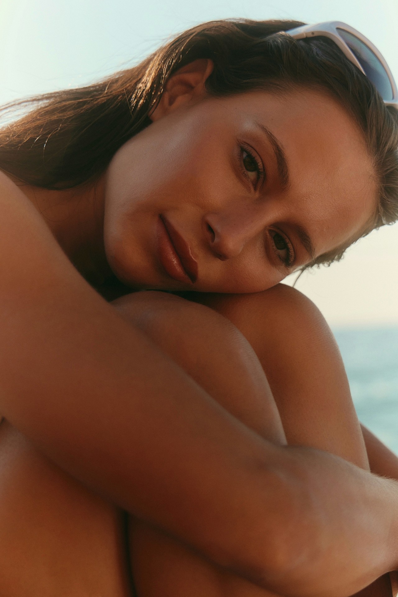
A campaign focused on clarity, proportion, and material detail. The project centred on developing a restrained visual language that reflected Glossier's emphasis on precision and craft, using controlled compositions, shaped light, and minimal set design. Casting and styling were kept understated to allow form, surface, and fit to take precedence. The resulting imagery balanced editorial tone with product focus, presenting products as both functional objects and considered design pieces.
Collaborators
Styling — Alice Wester Production — John Barry Assistant — Jack Pullman
[ Prev
1/5
2/5
3/5
4/5
5/5
|
Next ]
02.
[ Archive ]
& Other Stories
Art Direction & Photography
Stockholm, SW
02/2022
Overview
A campaign focused on clarity, proportion, and material detail. The project centred on developing a restrained visual language that reflected Glossier's emphasis on precision and craft, using controlled compositions, shaped light, and minimal set design. Casting and styling were kept understated to allow form, surface, and fit to take precedence. The resulting imagery balanced editorial tone with product focus, presenting products as both functional objects and considered design pieces.
Collaborators
Styling — Alice Wester Production — John Barry Assistant — Jack Pullman
[ Prev
1/5
2/5
3/5
4/5
5/5
|
Next ]
02.
[ Archive ]
& Other Stories
Art Direction & Photography
Stockholm, SW
02/2022
Overview
A campaign focused on clarity, proportion, and material detail. The project centred on developing a restrained visual language that reflected Glossier's emphasis on precision and craft, using controlled compositions, shaped light, and minimal set design. Casting and styling were kept understated to allow form, surface, and fit to take precedence. The resulting imagery balanced editorial tone with product focus, presenting products as both functional objects and considered design pieces.
Collaborators
Styling — Alice Wester Production — John Barry Assistant — Jack Pullman
[ Prev
1/5
2/5
3/5
4/5
5/5
|
Next ]
03.
[ Archive ]
Service Works
Creative Direction
San Sebastian, SP
05/2021
Overview
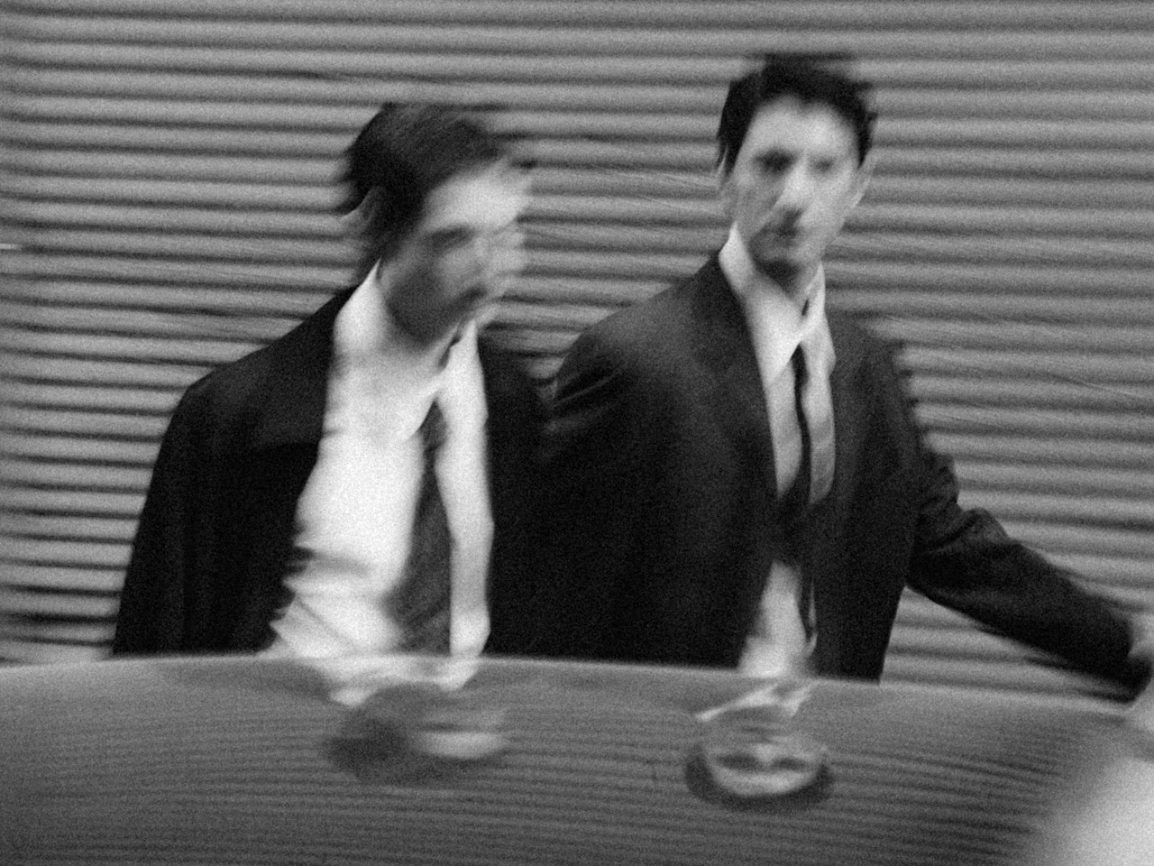
Sam led the creative direction for a spring/summer campaign focused on Service Works’ utilitarian roots and contemporary relevance. The brief centred on establishing a clear visual framework across photography and set design, drawing from references of functional labour, repetition, and everyday environments that are utilised and cherished. Emphasis was placed on casting, location, and material detail, allowing the garments to be read through use rather than styling. The resulting work presented the collection in a grounded, functional context, reinforcing the brand’s workwear ethos while maintaining a clean sensibility. The imagery was developed to function across digital and print contexts, maintaining cohesion at multiple scales. This ensured the work could be deployed flexibly without losing its grounded, utilitarian tone.
Collaborators
Assistant — Olivia Mackie First AD — Paul Lambert Art Direction — Sarah Granger Identity — Landscape Studio
[ Prev
1/5
2/5
3/5
4/5
5/5
|
Next ]
03.
[ Archive ]
Service Works
Creative Direction
San Sebastian, SP
05/2021
Overview
Sam led the creative direction for a spring/summer campaign focused on Service Works’ utilitarian roots and contemporary relevance. The brief centred on establishing a clear visual framework across photography and set design, drawing from references of functional labour, repetition, and everyday environments that are utilised and cherished. Emphasis was placed on casting, location, and material detail, allowing the garments to be read through use rather than styling. The resulting work presented the collection in a grounded, functional context, reinforcing the brand’s workwear ethos while maintaining a clean sensibility. The imagery was developed to function across digital and print contexts, maintaining cohesion at multiple scales. This ensured the work could be deployed flexibly without losing its grounded, utilitarian tone.
Collaborators
Assistant — Olivia Mackie First AD — Paul Lambert Art Direction — Sarah Granger Identity — Landscape Studio
[ Prev
1/5
2/5
3/5
4/5
5/5
|
Next ]
03.
[ Archive ]
Service Works
Creative Direction
San Sebastian, SP
05/2021
Overview
Sam led the creative direction for a spring/summer campaign focused on Service Works’ utilitarian roots and contemporary relevance. The brief centred on establishing a clear visual framework across photography and set design, drawing from references of functional labour, repetition, and everyday environments that are utilised and cherished. Emphasis was placed on casting, location, and material detail, allowing the garments to be read through use rather than styling. The resulting work presented the collection in a grounded, functional context, reinforcing the brand’s workwear ethos while maintaining a clean sensibility. The imagery was developed to function across digital and print contexts, maintaining cohesion at multiple scales. This ensured the work could be deployed flexibly without losing its grounded, utilitarian tone.
Collaborators
Assistant — Olivia Mackie First AD — Paul Lambert Art Direction — Sarah Granger Identity — Landscape Studio
[ Prev
1/5
2/5
3/5
4/5
5/5
|
Next ]
04.
[ Archive ]
Arket
Creative Direction
Helsinki, FI
12/2020
Overview
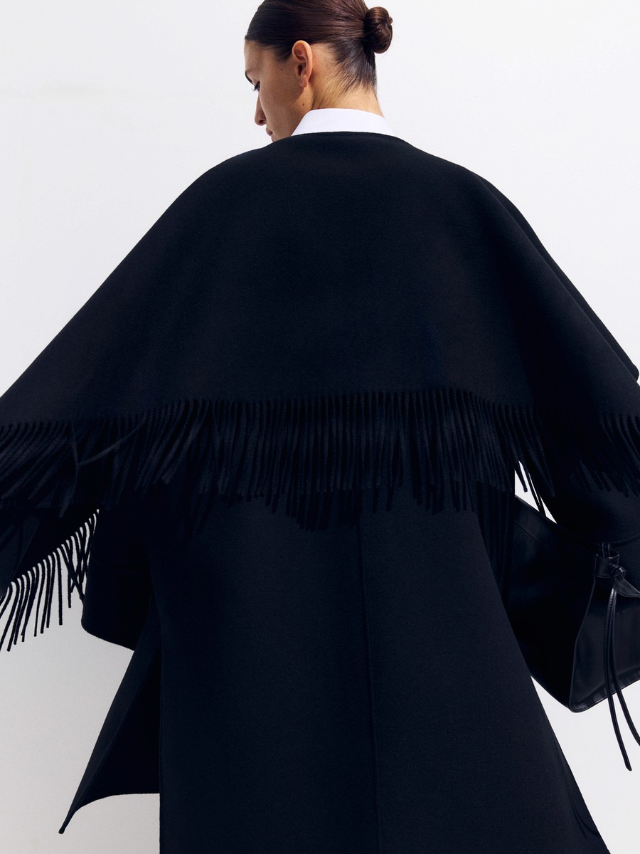
Direction and set design for a project exploring the balance of function, restraint, and everyday wearability. The work focused on constructing a minimal visual environment that complemented the brand’s design language, using simple structures, natural materials, and controlled light. Sets were designed to feel architectural, providing context without distraction.
Collaborators
Set Design — Katy Fornell Creative Direction — David Dolbeg Creative Direction — Elliot Vane Assistant — Caleb Shipp Production — Maria Laing Photographer — Chris Hamilton Model — Jane Riley
[ Prev
1/5
2/5
3/5
4/5
5/5
|
Next ]
04.
[ Archive ]
Arket
Creative Direction
Helsinki, FI
12/2020
Overview
Direction and set design for a project exploring the balance of function, restraint, and everyday wearability. The work focused on constructing a minimal visual environment that complemented the brand’s design language, using simple structures, natural materials, and controlled light. Sets were designed to feel architectural, providing context without distraction.
Collaborators
Set Design — Katy Fornell Creative Direction — David Dolbeg Creative Direction — Elliot Vane Assistant — Caleb Shipp Production — Maria Laing Photographer — Chris Hamilton Model — Jane Riley
[ Prev
1/5
2/5
3/5
4/5
5/5
|
Next ]
04.
[ Archive ]
Arket
Creative Direction
Helsinki, FI
12/2020
Overview
Direction and set design for a project exploring the balance of function, restraint, and everyday wearability. The work focused on constructing a minimal visual environment that complemented the brand’s design language, using simple structures, natural materials, and controlled light. Sets were designed to feel architectural, providing context without distraction.
Collaborators
Set Design — Katy Fornell Creative Direction — David Dolbeg Creative Direction — Elliot Vane Assistant — Caleb Shipp Production — Maria Laing Photographer — Chris Hamilton Model — Jane Riley
[ Prev
1/5
2/5
3/5
4/5
5/5
|
Next ]
05.
[ Archive ]
Weekday
Art Direction & Photography
Long Beach, CA
10/2020
Overview
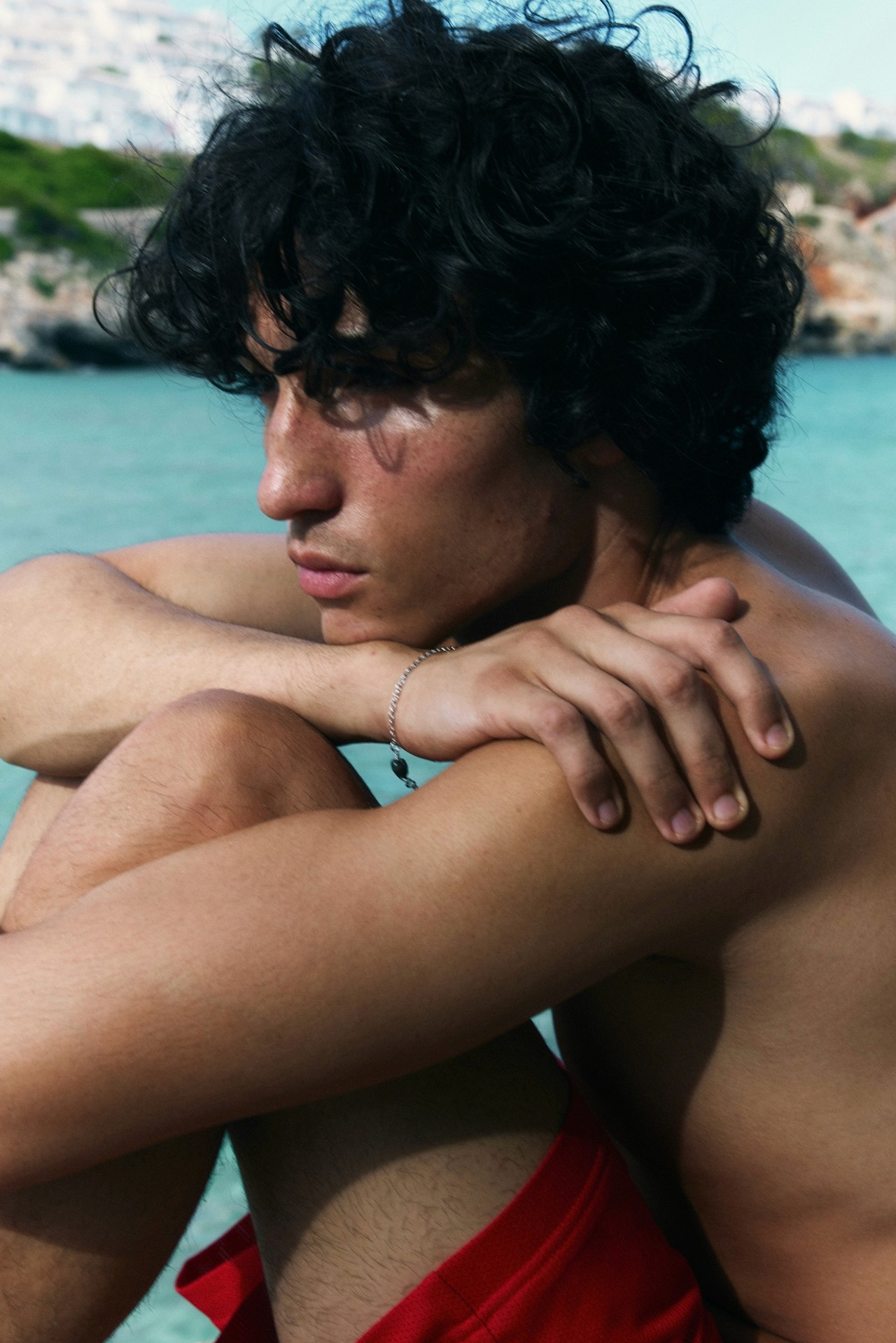
Sam led the art direction and photography for a project centred on the brand's irreverent tone and close relationship to skate culture. The work focused on developing imagery that felt immediate and unpolished without becoming careless, balancing documentary instincts with a clear visual structure. Locations, casting, and timing were treated as core creative tools, allowing attitude and environment to shape the narrative. The resulting images maintained a sense of spontaneity while remaining cohesive.
Collaborators
Art Direction — Daisy Pool Creative Direction — Emma Hunter Production — OMSE Studio
[ Prev
1/5
2/5
3/5
4/5
5/5
|
Next ]
05.
[ Archive ]
Weekday
Art Direction & Photography
Long Beach, CA
10/2020
Overview
Sam led the art direction and photography for a project centred on the brand's irreverent tone and close relationship to skate culture. The work focused on developing imagery that felt immediate and unpolished without becoming careless, balancing documentary instincts with a clear visual structure. Locations, casting, and timing were treated as core creative tools, allowing attitude and environment to shape the narrative. The resulting images maintained a sense of spontaneity while remaining cohesive.
Collaborators
Art Direction — Daisy Pool Creative Direction — Emma Hunter Production — OMSE Studio
[ Prev
1/5
2/5
3/5
4/5
5/5
|
Next ]
05.
[ Archive ]
Weekday
Art Direction & Photography
Long Beach, CA
10/2020
Overview
Sam led the art direction and photography for a project centred on the brand's irreverent tone and close relationship to skate culture. The work focused on developing imagery that felt immediate and unpolished without becoming careless, balancing documentary instincts with a clear visual structure. Locations, casting, and timing were treated as core creative tools, allowing attitude and environment to shape the narrative. The resulting images maintained a sense of spontaneity while remaining cohesive.
Collaborators
Art Direction — Daisy Pool Creative Direction — Emma Hunter Production — OMSE Studio
[ Prev
1/5
2/5
3/5
4/5
5/5
|
Next ]
06.
[ Archive ]
Goldwin Global
Photography
Kaminoyama, JP
10/2020
Overview
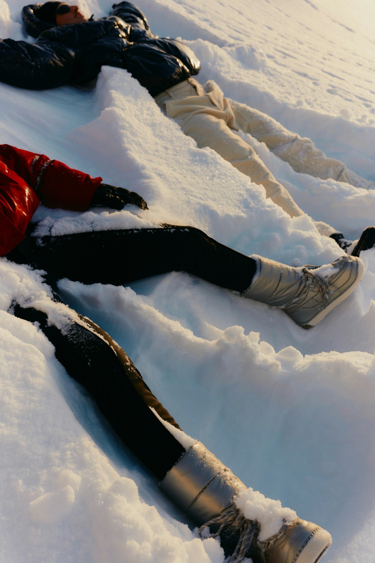
Creative direction for a global campaign developed around Goldwin’s approach to performance, restraint, and environmental consideration. The project focused on establishing a unified visual language that could translate across regions while remaining grounded in the brand’s Japanese design principles. Imagery balanced technical clarity with a quieter, more contemplative tone, using location, casting, and set construction to frame garments within systems of movement, climate, and use. Attention was given to consistency and longevity, ensuring the work could extend across multiple touchpoints without dilution. Rather than emphasising speed or spectacle, the campaign prioritised precision, material intelligence, and continuity.
Collaborators
Creative Direction — Robert Taylor Art Direction — Amy Finhorn Production — Ruby Smith Production — Samantha Jones Styling — Florian Lookman Casting — Julie Danner
[ Prev
1/5
2/5
3/5
4/5
5/5
|
Next ]
06.
[ Archive ]
Goldwin Global
Photography
Kaminoyama, JP
10/2020
Overview
Creative direction for a global campaign developed around Goldwin’s approach to performance, restraint, and environmental consideration. The project focused on establishing a unified visual language that could translate across regions while remaining grounded in the brand’s Japanese design principles. Imagery balanced technical clarity with a quieter, more contemplative tone, using location, casting, and set construction to frame garments within systems of movement, climate, and use. Attention was given to consistency and longevity, ensuring the work could extend across multiple touchpoints without dilution. Rather than emphasising speed or spectacle, the campaign prioritised precision, material intelligence, and continuity.
Collaborators
Creative Direction — Robert Taylor Art Direction — Amy Finhorn Production — Ruby Smith Production — Samantha Jones Styling — Florian Lookman Casting — Julie Danner
[ Prev
1/5
2/5
3/5
4/5
5/5
|
Next ]
06.
[ Archive ]
Goldwin Global
Photography
Kaminoyama, JP
10/2020
Overview
Creative direction for a global campaign developed around Goldwin’s approach to performance, restraint, and environmental consideration. The project focused on establishing a unified visual language that could translate across regions while remaining grounded in the brand’s Japanese design principles. Imagery balanced technical clarity with a quieter, more contemplative tone, using location, casting, and set construction to frame garments within systems of movement, climate, and use. Attention was given to consistency and longevity, ensuring the work could extend across multiple touchpoints without dilution. Rather than emphasising speed or spectacle, the campaign prioritised precision, material intelligence, and continuity.
Collaborators
Creative Direction — Robert Taylor Art Direction — Amy Finhorn Production — Ruby Smith Production — Samantha Jones Styling — Florian Lookman Casting — Julie Danner
[ Prev
1/5
2/5
3/5
4/5
5/5
|
Next ]